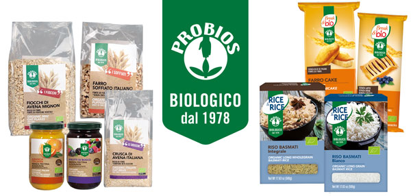
Developed in collaboration with the creative boutique Jam Communication, the new image wants to strengthen the brand recognition on the shelf and thus increase the Group's brand awareness. The values of the company find expression in a new visual identity, the result of a graphic redesign of the brand, with all its components, and packaging.
The traditional brand changes color, is included into a dark green band that highlights the logo and the history of the brand Probios ("ORGANIC since 1978") harmoniously integrating the brand of the single product line.
Il tradizionale marchio cambia tonalità, va ad inserirsi all’interno di una fascetta verde scuro che mette in evidenza il logo e la storia di marca Probios (“BIOLOGICO dal 1978”) integrando in modo armonico anche il brand della singola linea prodotto. The consumer thus recognizes the identity of each brand, perceiving the line as a branch of the Probios Group, whose brand retains its distinctive features. The iconic image of the logo ("Pro" - "Bios", in favor of life) remains, in fact, unchanged: man and nature meet symbolically inside a circle, representing the world, life.
“Investing on the brand image means focusing on the characteristics that outline the personality of the company and its products. Through this new design we want to leverage on a better visual impact, with the aim of growing in terms of trust and giving greater consistency to our products and lines, thus making the Probios brand immediately recognizable in the eyes of the consumer” explained Elisa Favilli, Marketing & Communication Manager of Probios.
The redesign of the brand is accompanied by a complete restyling of the packaging that expresses the whole universe of Probios values, such as attention and control of the raw material and respect for the environment. The photo of the main ingredient is inserted into a more modern and essential graphic, which plays on improving the relationship with the warmer and more defined colors of the earth and nature. The consumer is brought back to the naturalness and genuineness that distinguish the Probios offer that, for 40 years, has been working to improve the life of man and the planet, spreading an organic vegetarian culture that creates wellness, with taste and quality.
Some informations on the product are also implemented: its use, nutritional characteristics or how to dispose of the packaging.
The project of the new Visual Identity, destined to progressively redefine the image of the entire Probios range, started from the graphic review of the packaging of two historical product lines, namely Rice&Rice and Break&Bio, already on the shelf with the new look.
The first new product of this May already released with the new look is the innovative Cous Cous Time!
Discover it in both low fat flavors and in the practical cup to take with you, you can cook it in 3 ways following the simple instructions on the package, perfect for eating out!
Download HERE the official press release.
Probios Brand ↓
[gallery link="file" columns="4" ids="30616,30615,30614,30613,30618,30617,30612,30619"]
Rice&Rice range ↓
[gallery columns="2" link="file" ids="30622,30623,30624,30625"]
Break&Bio range ↓
[gallery link="file" columns="2" ids="30628,30629"]


